Project 1 - Color Mapping


Key Dates
| Handed out: | September 14, 2015 |
| Due date: | September 29, 2015 (before 5:00 PM) (EXTENSION) |
Objectives
The theme of this project is color visualization. You will work with 2 datasets from different application domains and in each case your task will be to select an effective color map to represent the data. In your report, you must justify the design decisions you made in picking a particular color map and provide a critical assessment of the strengths and weaknesses of each considered color map. Your argumentation should address perception aspects and take into account the specific properties (qualitative and quantitative) of each dataset.
Background
The purpose of a color transfer function is to express numerical values through colors by constructing a mapping (a function) from value space to color space.
Navigating the color space
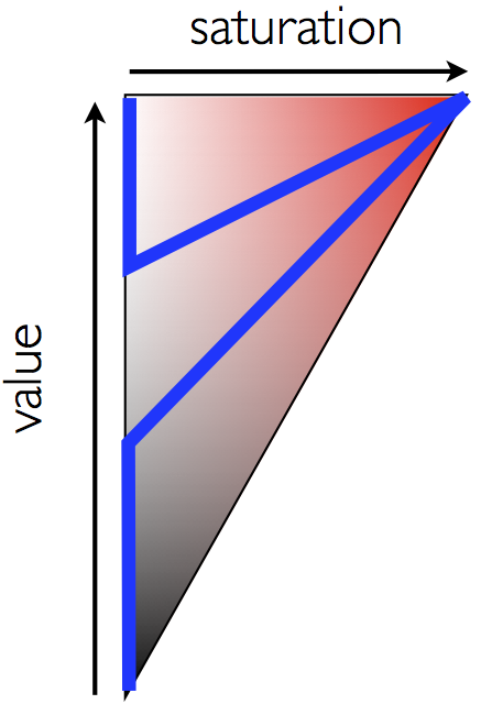
We saw in class that the color space is three-dimensional and that its 3 degrees of freedom correspond (roughly speaking) to 1) hue, 2) saturation (also called chroma or colorfulness), and 3) value (or lightness). A color scale corresponds to a curve through this 3 dimensional space with the associated variations of hue, saturation, and value. This curve, in turn, is defined by control points that explicitely assign a color to specific values. Hence, choosing control points does two things: we select the geometry of the curve (how does it look?) by indicating consecutive points along it and we fix the parameterization of the curve (how fast are we moving along the curve?) by specifying how changes in value correspond to a motion along the curve.

Discrete and continuous color maps
For the same given set of control points of a transfer function, two types of color maps are possible: discrete and continuous. Discrete color maps do not interpolate the color between their control points, thereby assigning piecewise constant colors to the data. In contrast, a continuous color map interpolates between two consecutive control points and represents regions of smoothly varying values with smooth color changes.
How to pick control points?
To successfully complete the tasks below, you will need to understand the meaning of a given value (or value range) in the considered dataset. Designing a color map amounts to selecting a number of control points that fix the relationship between values and colors at discrete locations and computing the remaining (value, color) pairs through interpolation. Unless you are very familiar with a dataset, finding good control points can be difficult and time-consuming. To make this problem more tractable, I am providing a small program that allows you to interactively highlight a range of values in a gray scale visualization. You will apply this tool to complete the project.
Exploring the value space
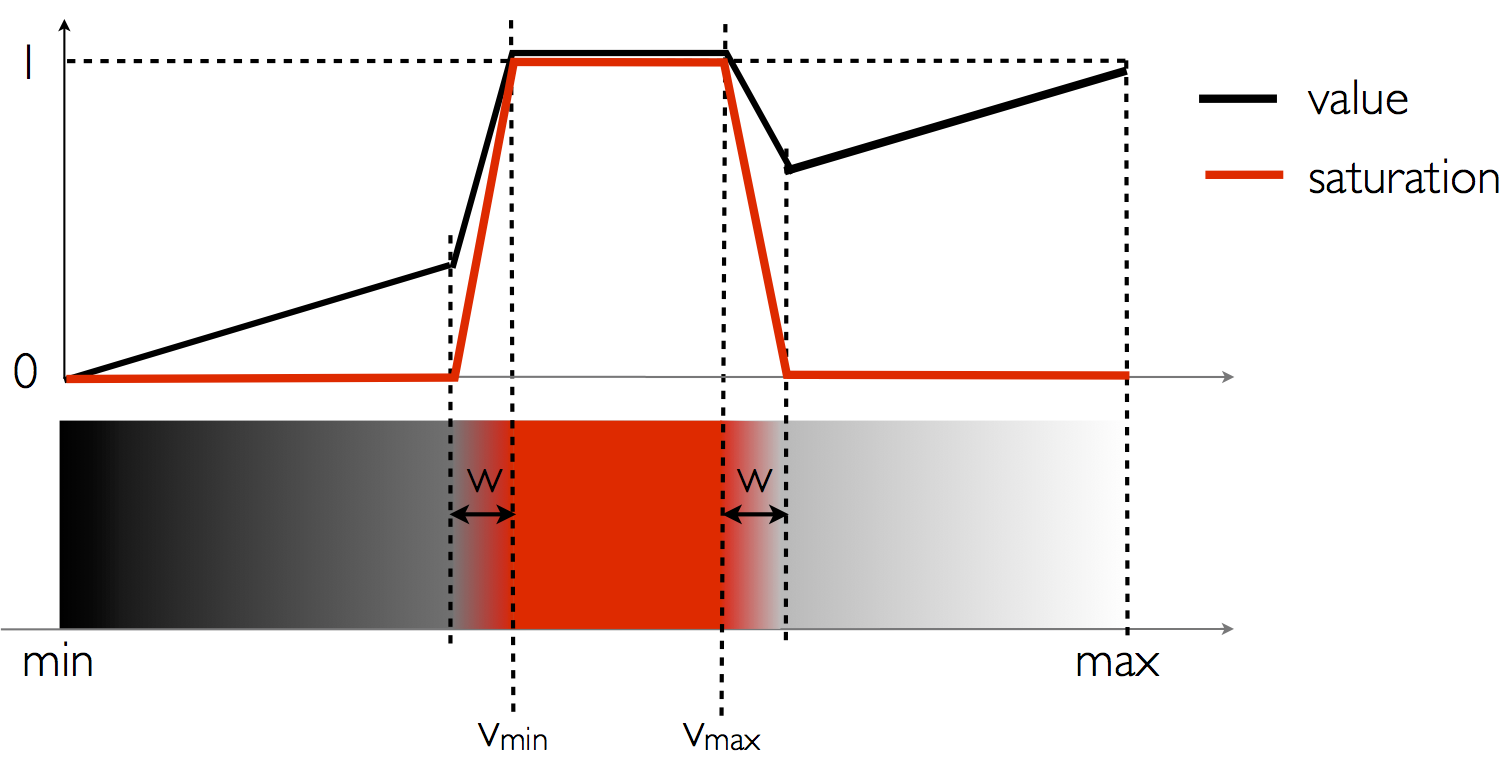
As stated above, getting a good understanding of the value space is a nontrivial task. One way to facilitate this process is to interactively select a range of values and highlight the corresponding portion of the dataset in an otherwise grayscale color representation. The included python program implements this strategy and uses the color map shown in the images below.


Task 1. MRI Data
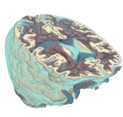
Magnetic resonance imaging (MRI) is a powerful noninvasive medical imaging modality. In this task you are given 3 axial slices extracted from of a MRI dataset of a human head courtesy of NIH NLM’s Visible Human Project. Your first task is to create, with the help of the program discussed in the previous section, an effective color mapping to distinguish the important anatomical structures(*) that can be seen in those slices (among air, skin, bones, muscles, white matter, gray matter, fat, ...) and to then apply your color map to visualize the data.
Color bar
As a general rule, a color map visualization must always be accompanied by a corresponding color bar that indicates the meaning of the colors shown. Therefore your visualization must include a color bar that describes your color map. Note that your program must also ensure that the color bar always reflects the choices made through the GUI.
Practically, color bars are created through a vtkScalarBarActor in VTK as demonstrated here.
Implementation
Specifically, you will write a program that allows the user to interactively toggle between a discrete color map and a continuous color map, each corresponding to a different set of color control points provided on the command line. You will apply the same color maps to all three slices. In summary, your program for this task must meet the following requirements.- Import the text description of the control points associated with the continuous and discrete case from files provided on the command line and create a corresponding color map visualization of the data.
- Provide a GUI with two radio buttons through which the user can choose between the discrete and the continuous color map and update the visualization instantly.
- Include a color bar showing the color map currently in use.
Your program will use vtkInteractorStyleImage to control the mouse interaction with the visualization. This interaction style precludes 3D manipulations while the data is 2D. Please refer to the supplied program to see how this class is used in a VTK program.
API
Your program will have following API:
> colormap[.py] <image>
            <continuous> <discrete>
where <image> is the
scalar image to visualize and <continuous>
(resp. <discrete>) is a file containing a text
description of the control points selected for a continuous (resp.
discrete) color visualization of this dataset. The format of your
control points information must be as follows.
- Lines starting with '
#' should be considered comments and ignored. - The first non-comment line will indicate the number of
control points defined in the file followed by either
"
RGB" or "HSV" to indicate the color space in which the control points are defined. - Each following line that is not a comment will indicate
the value color pair in the selected color space. It will have
the form "
<value> <x> <y>
                <z>
" where "<x> <y> <z>" are the 3 coordinates in the chosen color space of the color associated with<value>.
Report
- Include high quality images showing the visualization results achieved by your color map on each slice. Do so for both continuous and discrete versions of your color map.
- Explain how you have selected your color map and motivate this choice. In particular, include pictures created by the value browser program and discuss their connection to the control points you have chosen.
- Include a critique of your visualization and describe the anatomical structures that are revealed by your color map.
- Discuss the results obtained with the discrete and the continuous color maps and comment on their respective suitability for this dataset.
- Include any necessary close-ups.
Task 2. Topography Data
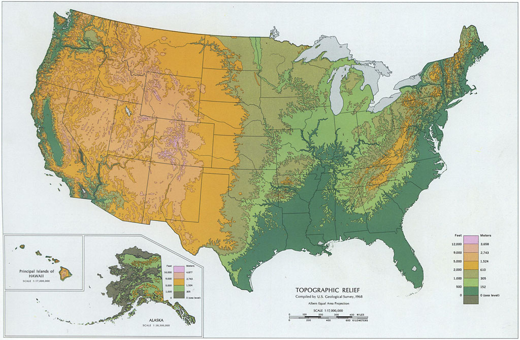
For the second task of this project you will focus on the topography data of the western part of the United States. Like in the previous task, your goal is again to design a suitable color map and create a good visualization for this type of data. You will reuse here the program that you wrote in Task 1 and use the same API to supply both image and control points on the command line.
Report
- Include high quality images showing the visualization results achieved by your color map (both continuous and discrete) on the topography dataset.
- Explain how you have selected your color map and motivate this choice. Include any necessary pictures.
- Provide a critical assessment of your visualization and indicate which topographic features are revealed by your color map.
- Compare the results obtained with the discrete and the continuous color maps.
- Include any necessary close-ups.
Discussion
The report plays a significant role in this project. As indicated above, you are expected to provide a discussion of the approach you used to design your color maps, the criteria you applied in selecting them, and their respective strengths and limitations. Use in your reasoning arguments based on the information that we saw in class about color perception. Also, make sure to take into account the specific properties of the data.
Helper Tool
The program needed to get a better understanding of each dataset can be downloaded at following URLs:
valbrowser.py valbrowser_noQt.py
These programs allow you to browse the range of values present in each dataset and understand their meaning in the context of the data as well as their spatial distribution. The first program requires PyQt4 and a VTK installation that supports Qt. The second program does not use Qt and will work with any installation including Python support. Both offer similar features.
Data Set
The data needed for Task 1 is comprised of three axial slices from a MRI dataset.
MRI: axial1.vtk axial2.vtk axial3.vtk
The dataset needed for Task 2 corresponds to a portion of a world wide bathymetry dataset that covers the western part of the United States.
Topography: westUS.vtk
Report
Please refer to the class syllabus for report formatting guidelines. Your report should also address the points mentioned in the discussion section.Submission
Submit your solution for this project using turnin
before September 29, 2015 at 5:00
pm (EXTENSION). Refer to the instructions below.
- Include the program file along with any other source code you may have
- Include all the files necessary to describe your color maps in the specified format.
- Include
Makefile(if applicable). If you are using Visual Studio include the solution file (.sln) and the project files (.vcproj) that are needed to build your project. - Include high resolution sample images showing results for each task.
- Include a html or PDF report briefly summarizing what you have done and answering the questions.
- Include a
README.txtfile with compilation / execution instructions (optional). - Include all submitted files in a single directory named
<myLogin>_p1, where<myLogin>is your Purdue login. - Do not include binary files
- Do not include data files
- Do not use absolute paths in your code
After logging into
data.cs.purdue.edu, submit your assignment as
follows:
> turnin -c cs530 -p project1
            <dir_name>
where <dir_name> is the
name of the directory containing all your submission material.
Note that old submissions are
overwritten by new ones whenever you execute this command. To
verify the contents of an existing submission use the following
command:
> turnin -v -c cs530 -p
            project1
Do not forget the -v flag here,
as otherwise your submission would be replaced by an empty
one.