Project 1 - Interpolation and Color Visualization


Key Dates
Handed out: Tuesday January 23, 2018
Due: Tuesday, February 6, 2018 at 1pm
Overview
The project is divided in two parts. The first part considers the role of interpolation in the creation of continuous data reconstruction from discrete samples. For that purpose, you will apply different interpolation methods to a discrete dataset and assess the quality of the corresponding results on the basis of a reference dataset. The second part focuses on the effective use of colors to represent two-dimensional scalar datasets. Specifically, you will be asked to create several color maps that facilitate the visual inspection of datasets corresponding to different application scenarios.Part I. Data Reconstruction, Meshing, and Height Maps
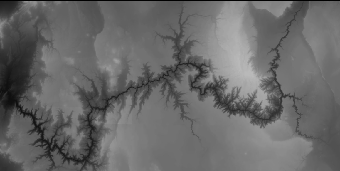
For this part, you will visualize the topography of Grand Canyon National Park. A natural way to represent this type of data is through a height map, whereby each (x,y) two-dimensional position is associated with a third (z) coordinate corresponding to the elevation at that location, thus creating a surface in 3D that conforms with the elevation profile. VTK provides a convenient algorithm to create such maps called vtkWarpScalar as demonstrated in the program ImageWarp.py (available under Examples/VisualizationAlgorithms/Python in your VTK source directory).
Practically, the data for this task comes in two forms: a large resolution scalar image and a point cloud. In the case of the point cloud, interpolation will be required to embed the discrete positions into a continuous elevation map. As we saw in class, this interpolation problem can be solved using one of two methods. The first method creates a piecewise interpolating function over the cells of a mesh. The second method interpolates the points without the support of a mesh by computing at any given location a weighted average of the surrounding data points. VTK supports both kinds of data reconstruction and you will compare them.
You will write a program, named heightmap[.py] that takes in input the name of a vtkImageData file containing a high resolution topography image (used as reference) as well as the name of the file containing the point cloud dataset provided as a vtkPolyData and compare mesh-based and mesh-free reconstruction techniques through side-by-side height map visualizations. Your program must perform the following tasks:
- Import from file both datasets using suitable data reader filters.
- Triangulate the point cloud using
vtkDelaunay2Dto form a piecewise linear topography approximation. - Apply a mesh-free interpolation method to the point cloud to create an image that matches both resolution and bounds of the reference topography image. Here, you will use
vtkPointInterpolator2Dalong with a quadratic (power 2)vtkShepardKernelto which you will assign a suitable radius. - Create a height map visualization for each of the two topography approximations that you created using
vtkWarpScalar(see above). The height maps will be displayed using two separatevtkRendererthat you will stack up in a singlevtkRenderWindowsimilar to what is demonstrated inCone4.py(available underExamples/Tutorial/Step4/Pythonin the VTK source directory). You will need to keep both renderers in sync and make sure that they show both height maps with the same camera settings. - In the case of the piecewise linear height map, your visualization will superimpose the edges of the triangulation produced by
vtkDelaunay2Dwhile in the case of the Shepard reconstruction, you will show the data points that were used to create the surface. Both techniques are demonstrated inExamples/Modelling/Python/DelMesh.pyin your VTK source tree. vtkWarpScalaroffers a scale factor (selectable throughSetScaleFactor) that controls the amount by which the image is moved up or down for a given scalar value at each point. Include in your program a slider GUI to control the value of this scaling factor and interactively update the visualization. Refer to the instructions provided here to create your GUI. Select a sensible range for the scale parameter. Note that you will need to multiply the selected scale factor by -1 to obtain a correct result. Note also that the edges (resp. data points) shown with the piecewise linear height map (resp. mesh-free reconstruction) must follow the surface as the scale factor changes.- Apply to each height map a color map that assign the color black (0,0,0) to the lowest altitude and a brownish orange color (175, 130, 100) to the highest altitude.
The API for your program should be as follows:
> heightmap[.py]
            <topography> <point_cloud>
where <topography> is the path to the high resolution topography image file and <point_cloud> is the path to the point cloud dataset.
In your report, comment on the results obtained with each interpolation method. What technique do you consider superior and why? How did the height map visualization contribute to your assessment of the quality of the reconstruction achieved by each method? Did you find the interaction mechanism helpful? Provide detailed answers and justify your assessment by drawing from specific observations you made.
Part II. Color Visualization
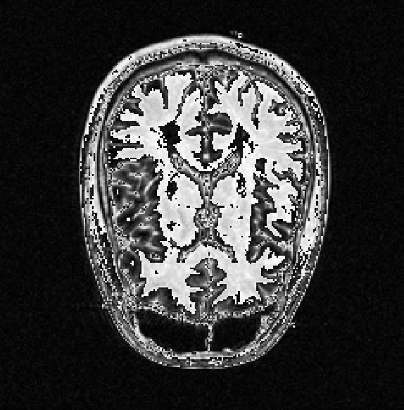
Color visualization is the most commonly used method to represent a 2D scalar dataset, whereby different colors to visually encode different values. Indeed, colors are a powerful means to emphasize various features of the data and an effective use of colors will naturally draw the user's attention toward the interesting properties of the dataset. In this task you will apply this technique to two datasets, a MRI image of a human head and a CFD simulation of a flow past a cylinder.
Note that while VTK automatically creates a color map for scalar attributes (through vtkMapper), your task here is to apply your own own color scales that you find effective for the data.
We will see in class that the color space is three-dimensional and that its 3 degrees of freedom correspond (roughly speaking) to 1) hue, 2) saturation (also called chroma or colorfulness), and 3) value (or lightness). A color scale is therefore a curve through this 3 dimensional space with the associated variations of hue, saturation, and value. This curve, in turn, is defined by control points that explicitly assign a color to a specific value. Hence, the choice of control points determines both the geometry and the parameterization of the curve by specifying how changes in value correspond to a motion along the curve.

You will create two color maps (one per dataset, see below) that emphasizes the significant characteristics of each data set. To that end, you may consider questions such as: what do the extreme values represent? Is there a natural midpoint in the scalar data? Should there be perceived boundaries in the color scale? What color map would best fit the data characteristics? Do certain colors intuitively fit the problem? etc...
After deciding on the color map, your task is to define your chosen color map through a vtkColorTransferFunction and apply it to the visualization of the dataset. Refer to the various examples provided in the online documentation about the use of vtkColorTransferFunction. In particular, note that you must prescribe (value, color) pairs to control how fast the color changes as the scalar value moves.
As a general rule, a color visualization must always be accompanied by a corresponding color bar that provides a visual reference for the meaning of the colors shown. Include a color bar in your visualization by using vtkScalarBarActor as demonstrated here.
Practically you will create a separate program for each color scale, thereby hard coding the color scale of your choice in each program. Your programs will be named pressure_color[.py] for the CFD dataset and mri_color[.py] for the medical imaging dataset.
The API for your programs should be as follows:
>pressure_color[.py]
            <cfd>
where <cfd> is the path to the CFD dataset containing pressure information and
>mri_color[.py]
            <mri>
where <mri> is the path to one of the three MRI datasets.
In your report, you must justify the design decisions you made in picking a particular color map and in particular indicate what important aspects of the data are revealed by your color visualization. Your argumentation should address perception aspects and take into account the specific properties (qualitative and quantitative) of each dataset.
Data Set
The data needed for Part 1 consists of a topography image of Grand Canyon and a point cloud. The data needed for Part 2 includes 3 planar slices from a MRI dataset and a CFD dataset.
Grand Canyon: gdcanyon_image.vtk gdcanyon_cloud.vtk
MRI: axial1.vtk axial2.vtk axial3.vtk
CFD: flow.vtk
Report
Please refer to the class syllabus for formatting guidelines for project reports. Your report should also contain your answers to the questions asked in Part 1 and Part 2..Submission
Submit your solution for this project before Tuesday, February 6, 2018 at 1:00pm.
- Include the 3 program files along with any other source code you may have
- Include
CMakefilethat is needed to build your project (if applicable). - Include
- Include a html or PDF report summarizing what you have done. The report should include high resolution sample images showing results for each task.
- Include all files to be submitted in a single directory named
<username>_proj1where<username>is your Purdue account login name. - Do not include binary file
- Do not include data files
- Do not use absolute paths in your code
Put all your files in a folder and package your folder to a zip file. Submit your file through Blackboard submit. You can do so by logging into Blackboard, go to Course Content on the left column, and click on the Assignment: Project 1. There will be a section to attach files. Please make sure your file size is less than 20MB. Do not leave your submission to last minute, as often time Blackboard would be overloaded with requests and hang, and you may not get your submission uploaded on-time.