Programming Assignment 1: Basic Visualization Techniques
Key Dates
| Handed out: | August 27, 2020 |
| Due date: | September 10, 2020 (before 11:59 PM) |
Objectives
This first programming assignment will give you a quick overview of various basic visualization techniques while allowing you to become more familiar with a visualization library. You will work with a tabular dataset and visualize it in different ways. Since this is the first assignment, your visualizations will be rather simple and no interactivity is required.
Context
The dataset for this project is the classical old cars dataset, which lists several characteristics of various cars built between 1970 and 1982. This is a typical tabular dataset where the items (or keys) correspond to the individual car models and the attributes correspond to the available characteristics. This type of dataset is non-trivial to visualize because several attributes (in this case 6) need to be represented simultaneously. Here, we will mostly circumvent this challenge by considering different subsets of the data.
Practically, the dataset indicates the number of cylinders, the engine volume, the vehicle weight, the year, the geographic origin, the horsepower, and the gas mileage of 398 different models. The dataset is provided as a csv file.
Tasks
Task 1: Grouped Bar Chart
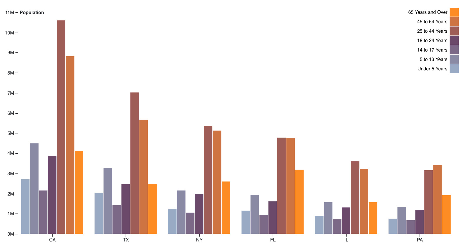
Visualize with a grouped bar chart (see above) the gas mileage distribution of all the models by geographic origin. In other words, you will create a chart in which each gas mileage value is associated with 3 bars (one for each origin: US, Europe, Japan) and show how the distributions of the gas mileage values compare across regions. For that you will discretize the range of possible gas mileage values in 2 mpg increments.
Deliverable: p1_grouped.py
Task 2: Line Chart
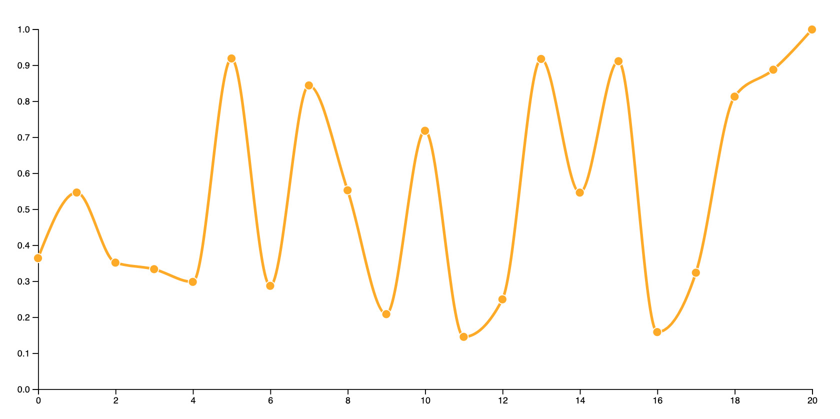
Visualize for each geographic origin the temporal evolution of the gas mileage from 1970 to 1982 using a line chart. Each data point will correspond to the annual average of the gas mileage for a given origin and each curve will comprise 13 points. Assign a different color to each curve.
Deliverable: p1_line.py
Task 3: Scatter Plot
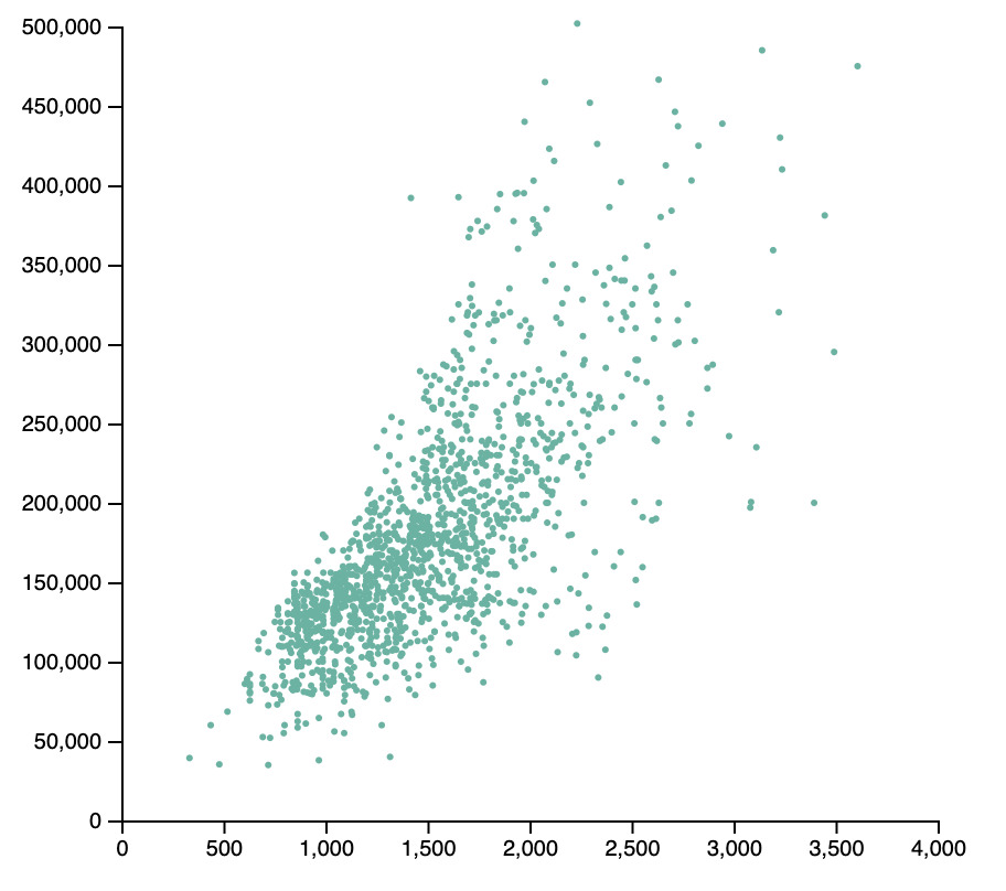
So far, we have only visualized a single attribute (ie. the gas mileage). For this third task, visualize the relationship between horsepower and gas mileage in a scatter plot. The horizontal axis should correspond to the horsepower, the vertical axis to the gas mileage and each data point to a particular car. Apply to the scatter plot a color coding indicating the year.
Deliverable: p1_scatter.py
Task 4: Scatter Plot Matrix
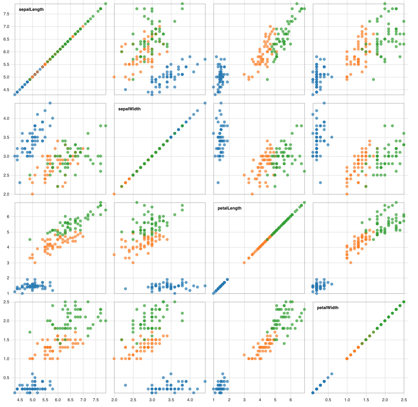
Visualize gas mileage, weight, horsepower, and engine size in a scatter plot matrix. Color code the individual data points by country of origin.
Deliverable: p1_matrix.py
Data Set
The dataset is available in CSV format here.
Submission
Submit your solution for this project on Brightspace before September 10, 2020 at 11:59 pm. Refer to the instructions below.
- Include all the requested python files: p1_grouped.py, p1_line.py, p1_scatter.py, and p1_matrix.py. Alternatively, include html files if you are using D3.
- Use Python 3 in your implementation as well as an up-to-date version of the visualization library of your choice (e.g., Bokeh 2.2)
- Include all submitted files in a single directory named
<me>_p1, where<me>is your Purdue login. Do not include the CSV data file in your submission. - Do not use an absolute path to access the dataset. Assume instead that it will be present in the same directory as your python files.


